Repeatedly I’ve said here, there, and everywhere that one of my favorite things about living in Europe is being able to travel for so cheap. There’s a multitude of airlines and destinations everywhere you look, and this is especially appealing for me as a cheap university student.
However, the first thing to attract customers is a seamless and easy booking process; that’s why having a minimally decent website is necessary.
So, I’ve ranked Europe’s low-cost carriers’ booking processes from the worst to the best, from what I’ve observed so far. Keep in mind it’s my personal perspective – therefore, it’s nothing scientific – and just to pass some time, so you might at the end think differently.
By the way: I’ve ignored startup LCCs, like Play, and the LCCs managed by the legacy carriers, such as Vueling.
easyJet: back to 2010
It’s quite surprising that I haven’t flown easyJet yet, since, here in Italy, they have quite a sizeable presence. In fact, they are the largest operator in Milan/Malpensa by quite some margin.
However, I always get the feeling that they website is a throwback to year 2011, it’s so unappealing to the eyes.
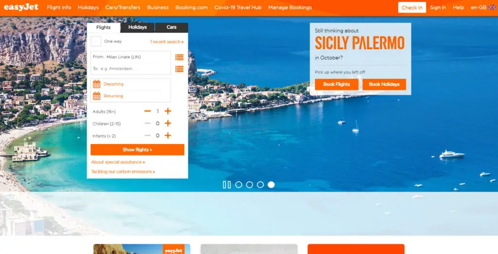
Finding the available destinations from a single origin is not particularly difficult at least.
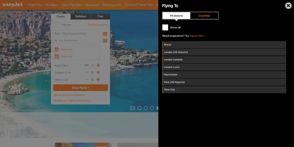
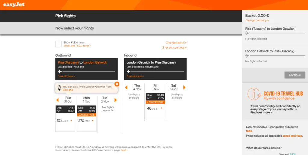
And nor is filtering fare deals either. Once you select a destination, it shows the calendar with the lowest fare for each date.
Once you get to the booking page, it gets awkward again. Look at the amount of wasted space here, that could better be used for showing the flight information in a way that’s more organized and spacious.
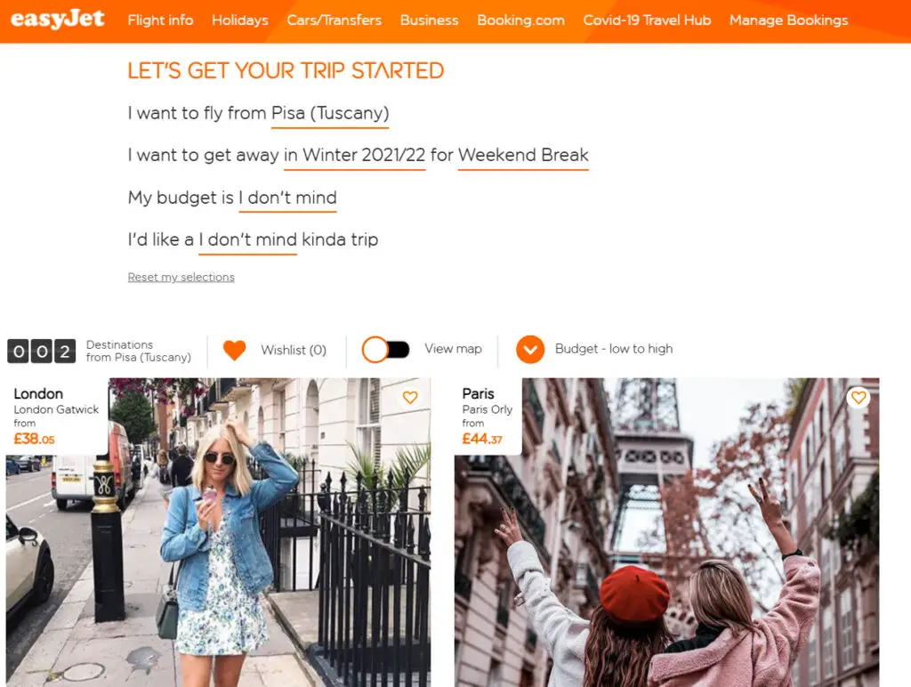
At least, their trip planner feature is not that bad – although, from my personal experience, they never have good last-minute deals, which at least in my opinion, might be good to them, business-wise.
Blue Air: okay, but minor bugs
For those who don’t know, Blue Air is a Romania-based low-cost with a sizeable presence in Italy.
These days I needed to fly for cheap from Bucharest to Italy and Blue Air was matched with Ryanair, but I could not finish the transaction as I wanted to pay with PayPal and the airline did not accept it.
But I hope to make it eventually, especially because they still have a couple of 737 Classics flying in Italy and I want to fly them.
As you can see below, their homepage is cool. It is also intuitive.

As you see in the lower side of the homepage, the website can easily redirect you to a fare finder.
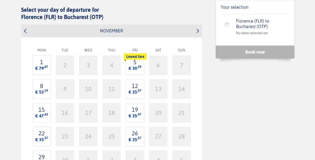
The flight selection page is also miles ahead of easyJet’s; you can see the flight details with much more space, in an easier manner.
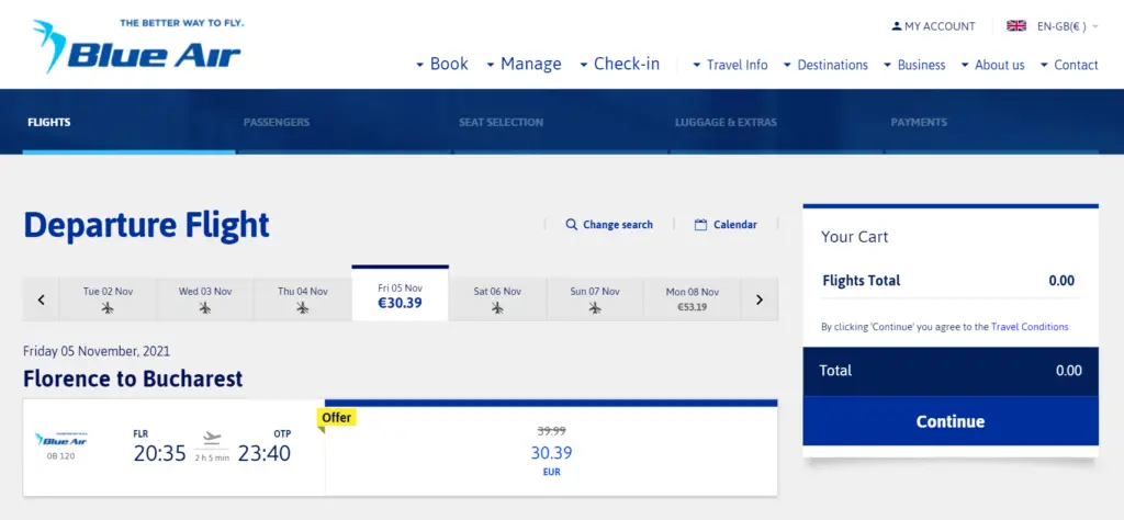
However, what upsets me is that Blue Air’s website has plenty of bugs. For example, when I was trying to buy that ticket back from Romania, it said there were flights between Bucharest and Bologna, but it retrieved none when I pressed the search button.
Another thing that is quite disappointing is the lack of automatization. For instance, I tried to get a EUR15 voucher that they advertised by showing proof of vaccination but never heard back from them. They said they needed to «validate» it – even though the vaccination proof in the European Union is a standardized certificate.
This and the fact that they also lack a «trip planner» like most of the other companies is what makes Blue Air’s website rank lower.
Norwegian: great website, missing features
Again, we fall on the problem of the point of sale – Italy’s not a market where they offer flights everywhere -, but this time it’s not really a problem. I mean, I cannot complain that Norwegian does not fly where I want them to.
But while it’s a pity that Norwegian only flies to Italy from Scandinavia (pre-COVID, they did a lot of long-haul too), they do offer an enjoyable time for extra-Scandinavia customers, unlike Jet2 and extra-UK customers.
And their website is fantastic. I just love Norwegian’s look and feel it just feels so right.
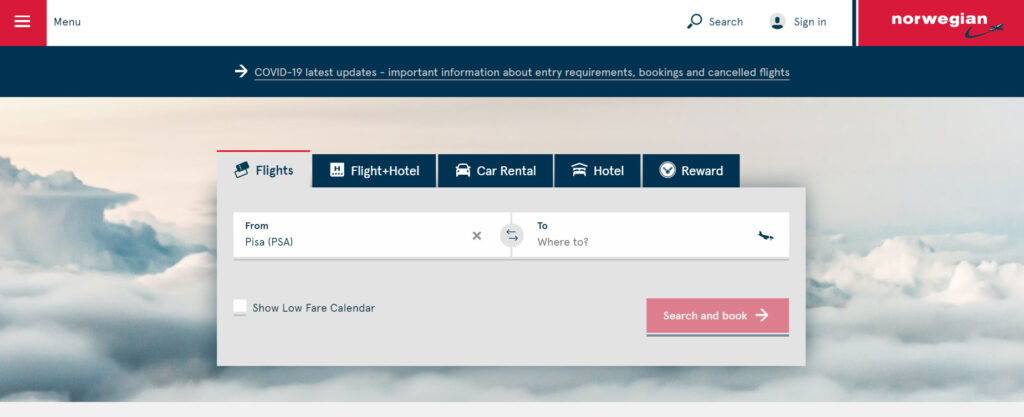
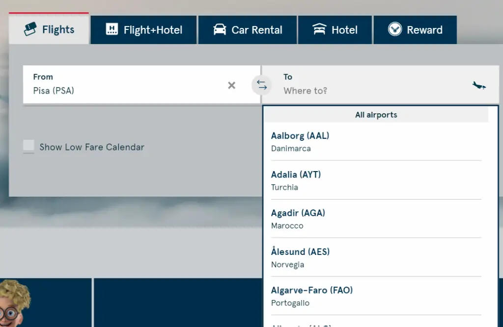
A big problem with Norwegian’s website is that you cannot see where they fly from the selected origin-destination. Okay, they do offer connecting flights, but they should at least not show those destinations unavailable also with connections.
Another upset is that they don’t offer a low-fare planner – perhaps because they’re not really a low-fare airline anymore? Well, at least the fares I search with them are never really the cheapest ones. At least their fare calendar is easy to manage.
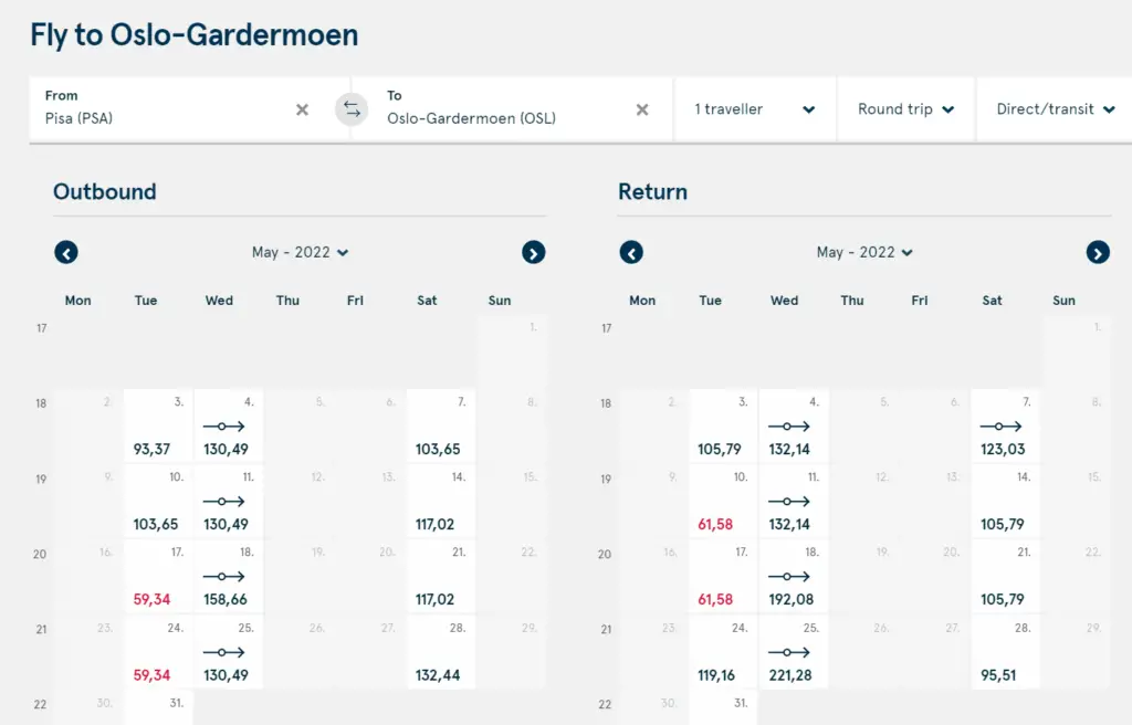
Their booking page is also very good in the sense that they are very clear with respect to the fare restrictions – to the point you can barely see other flight options –also, they’re the only ones to show the CO2 emissions of the flight, though only in a relative basis so they look good with respect to others, never in absolute numbers.
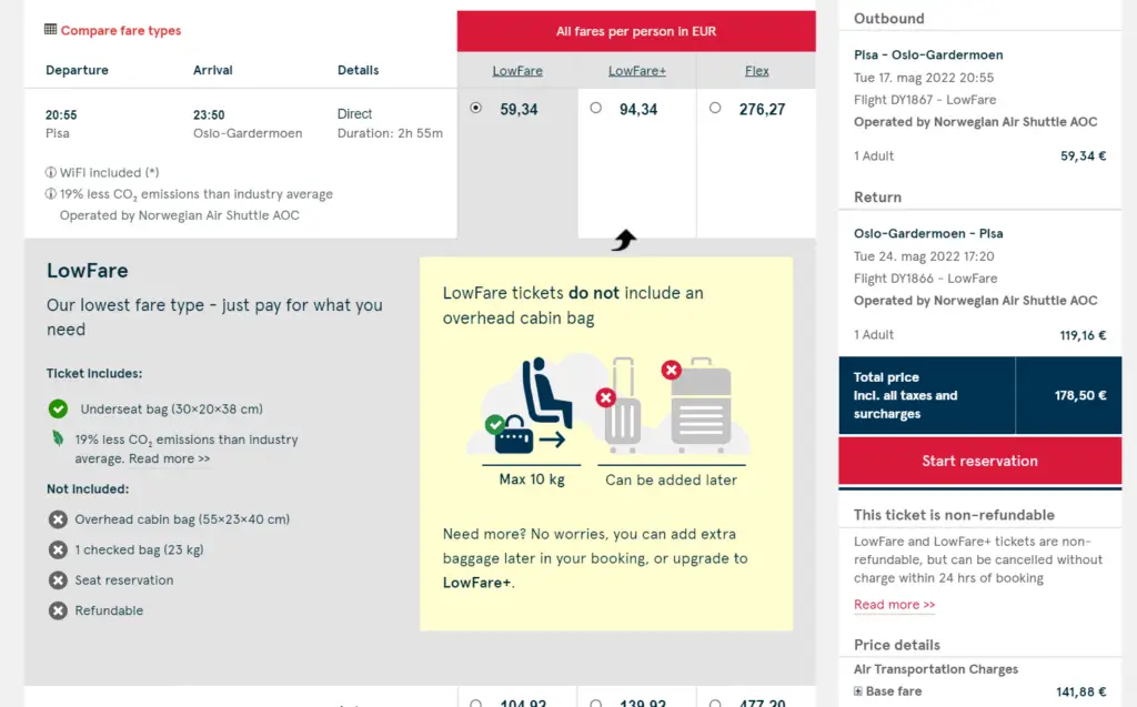
So, overall, a terrific website and great branding, but one that is not ranked within the best because it lacks especially key features.
Jet2: great website, too UK-centered
Jet2 is the airline that carries the British masses to beaches in Spain or any tourist city in Europe. As such, the website is naturally completely centered on the UK market.
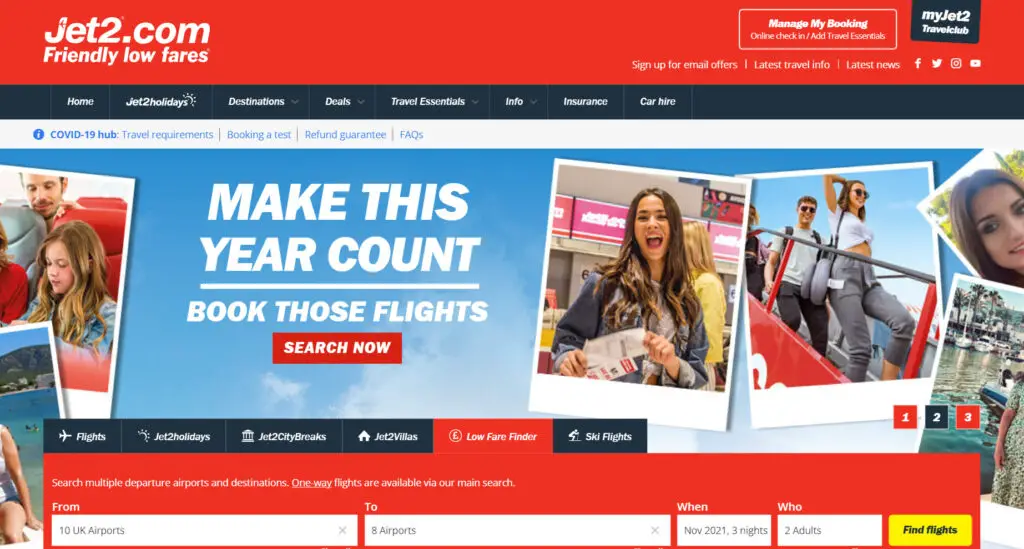
Here in Italy – in the off-season at least – they only serve Rome with a twice-weekly run to Manchester, and because the UK still requires 55 COVID tests and 13 months of isolation after arrival (and that’s if you’re vaccinated), I haven’t had the chance to fly with Jet2.
The website is remarkably nice and easy to navigate on, and filtering flights is quite easy – if you live in Britain. The trip planner feature also works very well.
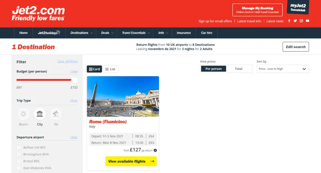
And what’s cooler – that I hadn’t seen before -, the planner feature is fully integrated into the booking page, which means you cannot miss the low fare, provided there is a low fare or multiple flights in a day/week.
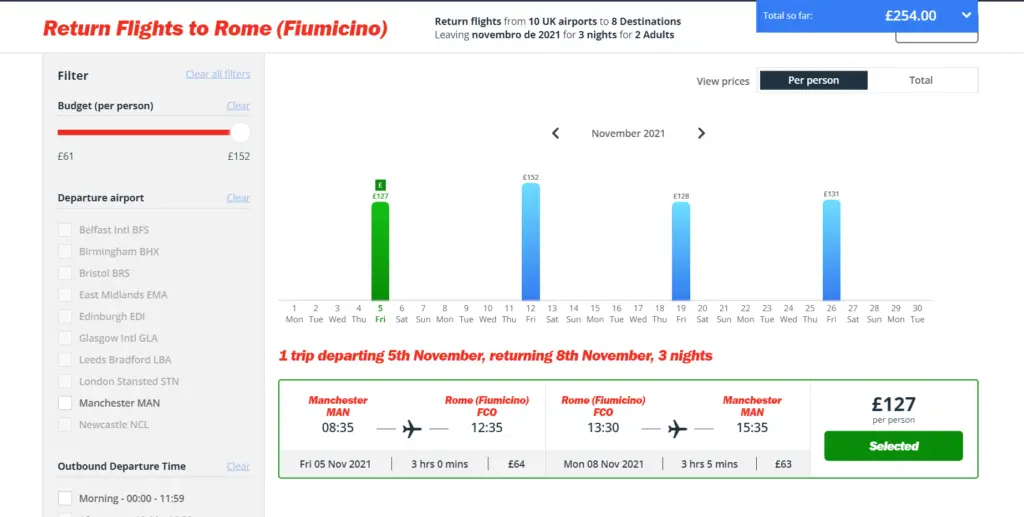
My only critic with respect to Jet2’s website, then, is that I cannot plan a trip to the UK from elsewhere; the rest is almost impeccable.
And now we get to the top three.
Wizz: ancillaries ahoy
Wizz has been growing like crazy in Italy later these days, though still not from Pisa, my home airport. Nevertheless, they were the first LCC I’ve flown with since arriving in Europe, so they have one of the websites I’m the most used to.
Naturally, as an airline that chooses pink and purple as their main color, they have the most in-your-face website. That could either be a disaster but also a blessing with respect to differentiating themselves from the competition.
Unsurprisingly as an exponent of low fares in Europe, they’ve managed not to screw up, which is why they are in my top 3.
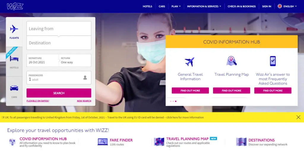
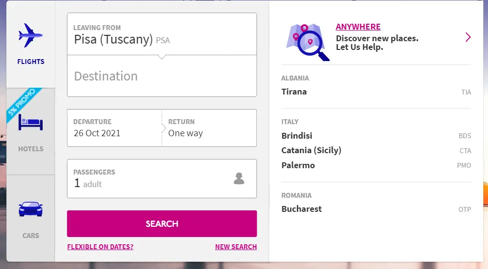
When selecting an origin airport, they only show the available airports, which would already put it ahead of other airlines’ websites here…
But it’s in their trip planner where they gain you.
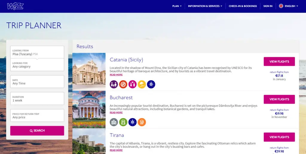
The planner redirects you to the fare calendar; both features, therefore, are integrated. And boy, their fares are wonderful too.
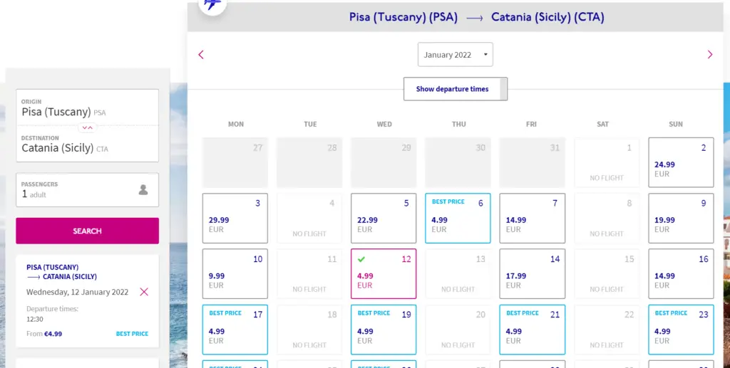
The booking page is good as well, but Wizz’s website is not rated higher only because of the pages after that. They try so hard to charge you for bags, food, seats, and everything that dodging these optional charges is almost confusing.
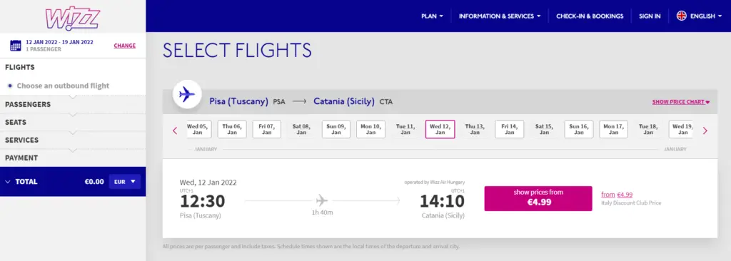
But perhaps that’s why, last quarter, their revenues with ancillary products were higher than their revenue with the actual fares.
Volotea: almost perfect
Volotea’s not a big a deal in the rest of Europe as it is in France, Spain, and Italy. Even in Pisa, they have a small operation, in fact; their strategy is exploring markets where no one operates, and with Ryanair flying everywhere from there, it gets tough to find a void.
Nevertheless, I flew with them once from Olbia, so I am quite used to their booking process, and they have an easy, seamless website. Their colors palette, full of neutral tones, helps to keep that impression.
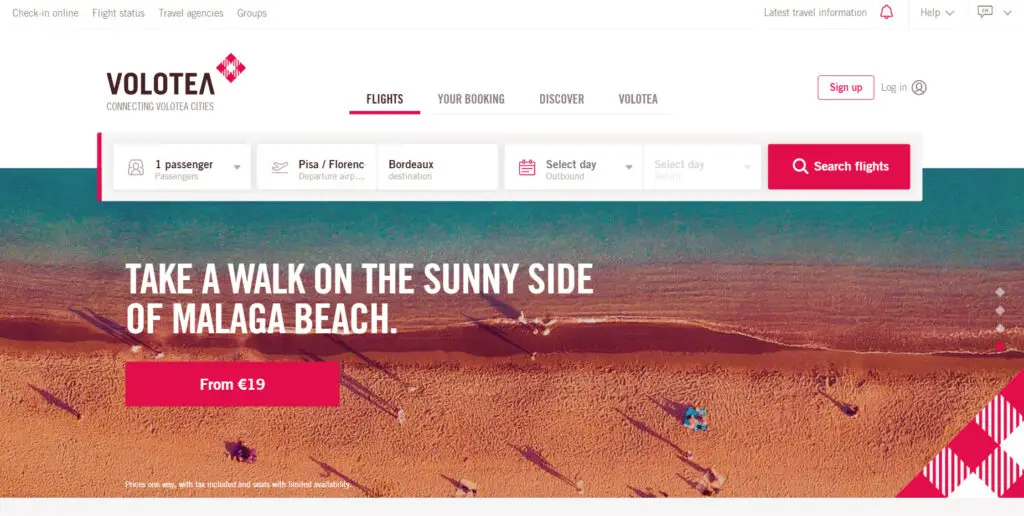
While they don’t offer a trip planner, their search engine is as good. I’ll explain once you select your origin, they show all destinations, along with the cheapest fare.
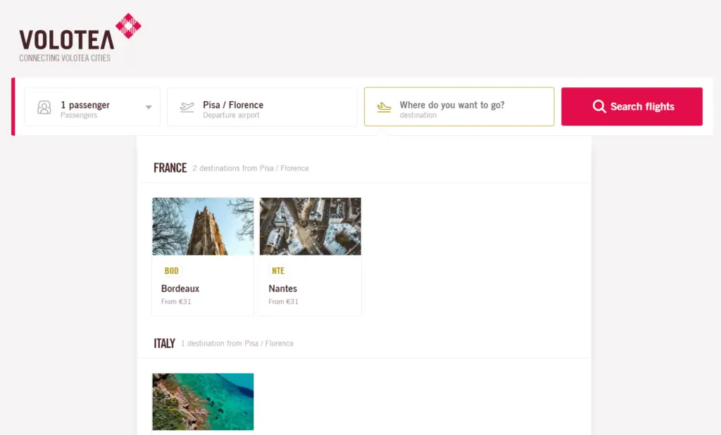
Only after that, you can choose the dates – which are integrated to the fare calendar.
The only problem is that the calendar is so oversized that you cannot have a clear overview of the month – and that upper bar eats up a lot of the space in the page as well.
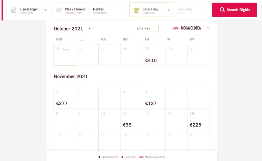
The biggest problem is that Volotea does not sell fare bundles – that is, there is only one type of fare, and you need to add your ancillaries one by one.
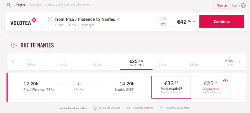
If it wasn’t for this, I think I would have ranked Volotea’s website the best.
Ryanair: all good things combined
Ryanair’s website manages to mix everything in the best feasible way. There are all features that make you find a great trip for a good fare.
Oh, and their homepage is quite cool, too.
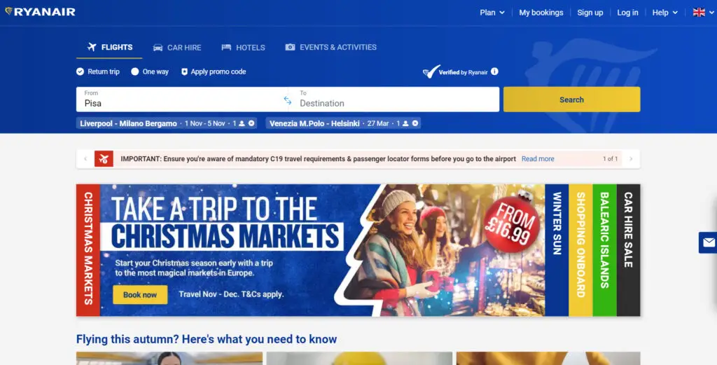
Once you select your origin, the website shows all available countries and destinations.
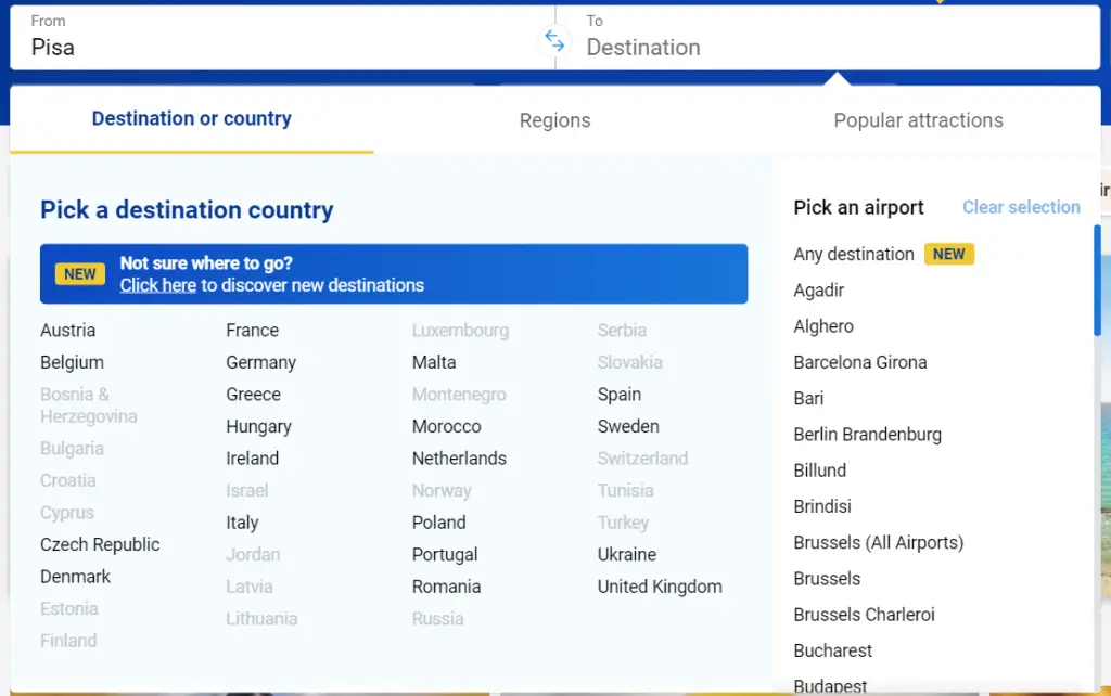
Now their trip planner feature is phenomenal, again dividing the destinations by countries and destinations.
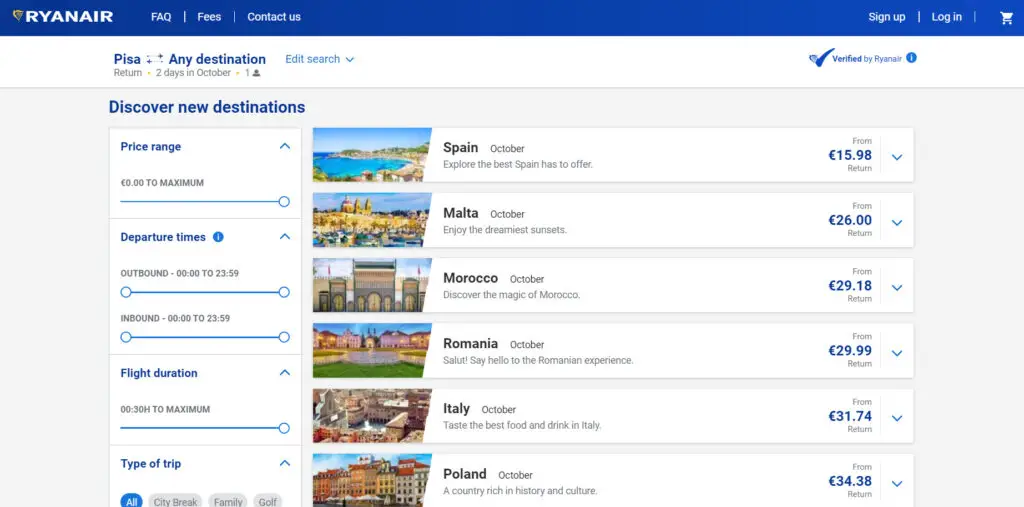
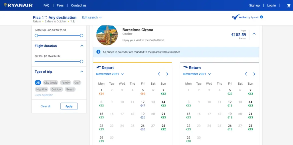
Once you choose the country and the destination, you see the fare calendar, without being redirected to another page. Just terrific.
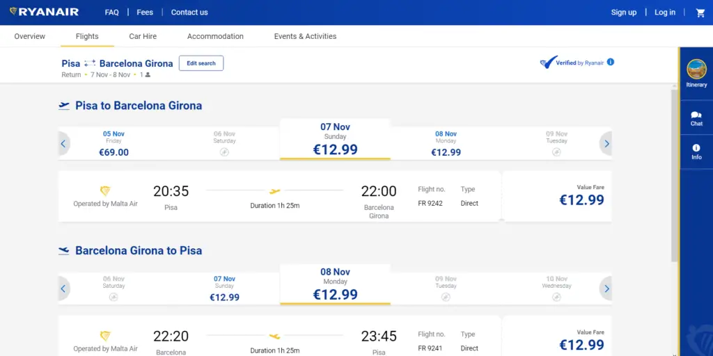
The booking page is also particularly good to the eyes, with great usage of space with the flight information.
So, overall, I think Ryanair’s website is my favorite by the sum of the factors; they manage to display all the great features of the other airlines’ pages, mastering perfectly the art of finding the best deal or weekend break to whichever destination you’d like – which ultimately is why I’m glad they have a base in my home airport.
Then, Europe’s very well served by its low fare airlines, and while the website is a relevant factor for me to choose an airline, the key factor – well, the decisive factor – for me and for millions around the continent will always be a low fare.
You can have the best airline website in the world, but as a certified penny pincher, if you don’t offer a low fare, forget it.


Comentarios
Para comentar, debés estar registrado
Por favor, iniciá sesión